Monday, November 10, 2008

masthead and t.o.c.


pretty simple design.

For the table of contents, I was thinking about the flow of information, starting with "Cover Stories" and continuing to the first article on the right side of the page, then moving down towards the "Features" and into the next page with the cropped photos arranged from smallest to largest.

Sunday, November 9, 2008

more wine

thought I'd go for a diagram/mechanical approach with the bottom two designs.

Monday, November 3, 2008

torn paper label


So, I think I'm liking this one the best so far. I was thinking about ways to represent water flowing and thought that I could show that by layering pieces of white paper and tearing the bottom edges. I was inspired by images of walls with layers and layers of posters plastered on and torn up. I thought that idea went well with the rustic yet classic look that I want for the wine label. I'm going to rip some paper and scan it in to make the background of the label, or I might paste the different layers on the actual wine bottle. I'm excited about this idea.

a new direction


thinking more abstractly with these

Sunday, November 2, 2008

more wine stuff

I went out to buy my wine the other day (Water Wheel 2005 Shiraz) and it probably has one of the strongest and richest flavors I've ever tasted in a wine, though I'm no wine connoisseur. There's a strong tobacco flavor in it. It was very interesting.

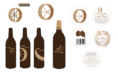
For the design, I worked on a 3d version of the water wheel and played with that. Then, I began to think about what other imagery I could use besides a water wheel. I thought about how it's grown and the flavors of the wine and thought I could reference those flavors on the bottle: plum/cherry/cedar/tobacco. If I made a set, I could have different illustrations on each bottle having to do with the flavors of each wine. I made a card with additional information and the bar code to go around the neck of the wine.
website progress


three directions (homepages) for the website. The photos. sample work, and logo are all shauna's. I wanted to create one really professional looking page (complete with drop shadows), one hand drawn, and one somewhere in the middle.

final magazine cover