Tuesday, October 28, 2008

water wheel wine


When I think of the water wheel, I think rustic, so that's where I was hoping to go with the redesign. I also wanted to have an established feel to it. Here's what I have so far. More to come.

Monday, October 20, 2008

wine hunt

wow....


bad,bad,bad:

are kids drinking wine now?

organic wine:

I'm not sure what's going on with this one:three possibilities for redesign?


Wednesday, October 15, 2008

Another tagline option


getting better... this tagline is driving me crazy...

Monday, October 13, 2008

working on a new tagline...

I drew the text out, scanned it in, and manipulated it. I decided to lean the letters toward the left, i.e. the west. Not sure if it works though...

pop-up calendar so far


This is definitely my favorite project in typography so far:
The pop-up letters are the 13 most used in the English language (need to mention that somewhere in the calendar):
1.E
2.A
3.R
4.I
5.O
6.T
7.N
8.S
9.L
10.C
11.U
12.D
13.P

Each month focuses on one PMS color and one sans-serif typeface. Each typeface has a short description and a fun pop culture fact about that font. For example, the text for the title of the film The Royal Tenenbaums is set in Futura. For someone who doesn't know a lot about typography, this would be an interesting way to learn about different typefaces with references they would recognize.

Monday, October 6, 2008

pop!

I was looking up pop up books the other day because I was thinking about incorporating that idea into my calendar, and I found some pretty interesting and creative stuff. This is pretty amazing... they're pop up books of lamps that actually light up when you open them.

some paper architecture by Ingrid Siliakus:
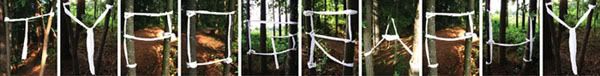
pretty amazing stuff... I can only imagine how much time and precision it took to make these.


Scott McCarney alphabet:

some other stuff: