Sunday, November 30, 2008

wine progress (construction)

For this first box, I covered a cardboard cylinder container with decorative paper. I used PVA to adhere the paper to the container, and then covered everything with methyl cellulose.


For the second container, I bought a cylinder box from the container store made with birch veneer wrapped around and glued to the sides of wooden circles. I replaced the leather cord closure with black twine, placed transfers on either end of the cylinder, inside the flap, and on the outside. I'm lining parts of the container (inside) with black suede. I'm also making a 3-4 inch wide paper slip to go over the cylinder with black textured paper, and a cover for the button.

My experience with placing transfers on the bottle was actually pretty good. I taped the transfers in place and used a spoon to rub them down. I only had to redo one piece.

I'm also working on a wine bag made with plum colored paper (similar to the color of the shrink wrap top on the wine).

this is funny


miniature replicas of large objects are just funny.

also large replicas of small objects, like those huge pencils or those really big alarm clocks. I don't know why, but they just make me laugh.

Saturday, November 29, 2008

I hope nobody gets as stressed as this guy before the semester over..

Friday, November 28, 2008

2 page layout directions


Continuing with the clean and simple look with these. I made illustrations for the first option (still working on a few more ingredient illustrations). For the second layout, I baked chocolate chip cookies from scratch and photographed them spread out on an old light box (used for looking at photo negatives). Thinking about adding some sort of texture in the background. not sure.

My article is a little wordy, so I might shorten it up a little.

Wednesday, November 12, 2008

Final Wine design

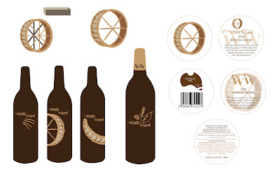
white transfer on a black bottle. The arm of the water wheel design wraps around to the back of the bottle where all the bulk type is. For the box, I was thinking of a wooden crate looking box with transfers.

Final t.o.c./ masthead


the line after the flower pot is not supposed to be there, so just ignore that.

Monday, November 10, 2008

masthead and t.o.c.


pretty simple design.

For the table of contents, I was thinking about the flow of information, starting with "Cover Stories" and continuing to the first article on the right side of the page, then moving down towards the "Features" and into the next page with the cropped photos arranged from smallest to largest.

Sunday, November 9, 2008

more wine

thought I'd go for a diagram/mechanical approach with the bottom two designs.

Monday, November 3, 2008

torn paper label


So, I think I'm liking this one the best so far. I was thinking about ways to represent water flowing and thought that I could show that by layering pieces of white paper and tearing the bottom edges. I was inspired by images of walls with layers and layers of posters plastered on and torn up. I thought that idea went well with the rustic yet classic look that I want for the wine label. I'm going to rip some paper and scan it in to make the background of the label, or I might paste the different layers on the actual wine bottle. I'm excited about this idea.

a new direction


thinking more abstractly with these

Sunday, November 2, 2008

more wine stuff

I went out to buy my wine the other day (Water Wheel 2005 Shiraz) and it probably has one of the strongest and richest flavors I've ever tasted in a wine, though I'm no wine connoisseur. There's a strong tobacco flavor in it. It was very interesting.

For the design, I worked on a 3d version of the water wheel and played with that. Then, I began to think about what other imagery I could use besides a water wheel. I thought about how it's grown and the flavors of the wine and thought I could reference those flavors on the bottle: plum/cherry/cedar/tobacco. If I made a set, I could have different illustrations on each bottle having to do with the flavors of each wine. I made a card with additional information and the bar code to go around the neck of the wine.

website progress


three directions (homepages) for the website. The photos. sample work, and logo are all shauna's. I wanted to create one really professional looking page (complete with drop shadows), one hand drawn, and one somewhere in the middle.

final magazine cover

Tuesday, October 28, 2008

water wheel wine


When I think of the water wheel, I think rustic, so that's where I was hoping to go with the redesign. I also wanted to have an established feel to it. Here's what I have so far. More to come.

Monday, October 20, 2008

wine hunt

wow....


bad,bad,bad:

are kids drinking wine now?

organic wine:

I'm not sure what's going on with this one:three possibilities for redesign?


Wednesday, October 15, 2008

Another tagline option


getting better... this tagline is driving me crazy...

Monday, October 13, 2008

working on a new tagline...

I drew the text out, scanned it in, and manipulated it. I decided to lean the letters toward the left, i.e. the west. Not sure if it works though...

pop-up calendar so far


This is definitely my favorite project in typography so far:
The pop-up letters are the 13 most used in the English language (need to mention that somewhere in the calendar):
1.E
2.A
3.R
4.I
5.O
6.T
7.N
8.S
9.L
10.C
11.U
12.D
13.P

Each month focuses on one PMS color and one sans-serif typeface. Each typeface has a short description and a fun pop culture fact about that font. For example, the text for the title of the film The Royal Tenenbaums is set in Futura. For someone who doesn't know a lot about typography, this would be an interesting way to learn about different typefaces with references they would recognize.

Monday, October 6, 2008

pop!

I was looking up pop up books the other day because I was thinking about incorporating that idea into my calendar, and I found some pretty interesting and creative stuff. This is pretty amazing... they're pop up books of lamps that actually light up when you open them.

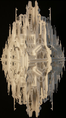
some paper architecture by Ingrid Siliakus:
pretty amazing stuff... I can only imagine how much time and precision it took to make these.


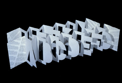
Scott McCarney alphabet:

some other stuff:

Monday, September 29, 2008

Sunday, September 28, 2008

13 Month Calendar

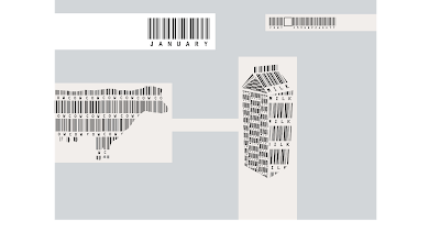
I'm thinking about making a calendar using bar code dingbats. Each month has to do with products we buy and use as consumers everyday and where they come from.
From nature to consumer:
1. cow to milk2. hen to eggs
3. tree to toilet paper
4. animal to meat
5. grapes to wine
6. wheat to bread
7. cotton to shirt
8. cocoa bean to chocolate
9. bee to honey
10. bone to jello
11. orange to juice
12. tomato to ketchup
13. brain to book

still thinking of some more examples

Wednesday, September 24, 2008


i never get tired of this song

for people on a budget


i'm totally going to try and make myself a cardboard table

Tuesday, September 23, 2008

At Barns and Noble

it's so fun and therapeutic to go to the book store, read, and look at all the book cover and magazine designs, photos, and illustrations. Here are a few publications I find very inspirational:
1. bon appetit magazineI'm in love with this magazine.. the design is amazing...simple...clean...beautiful, and the photos are good enough to eat. I think I've actually salivated looking at the photos, as gross as that sounds, but it's true.
yum

2. Fruits

crazy japanese street fashion... what's going down on the streets of japan (though i think this is from an old issue)
...and Finland:
Helsinki street fashion

3. chuck palahniuk book covers are good... obviously

this one is definitely my favorite


4. I just finished reading The Curious Incident of the Dog in the Night-time and I really enjoyed it. it's written in the first-person perspective of a boy from england with asperger syndrome. The chapters numbers are all prime numbers, because he's a mathmatics enthusiast. It's really insightful and really detailed. You really get sucked into his world.
it's nice to look at the world through other people's eyes sometimes.

5. Blankets
a beautiful graphic novel

Monday, September 22, 2008

sunset magazine re-design in progress

old logo:


re-design:
still going to work on the tagline, but this is what i have so far